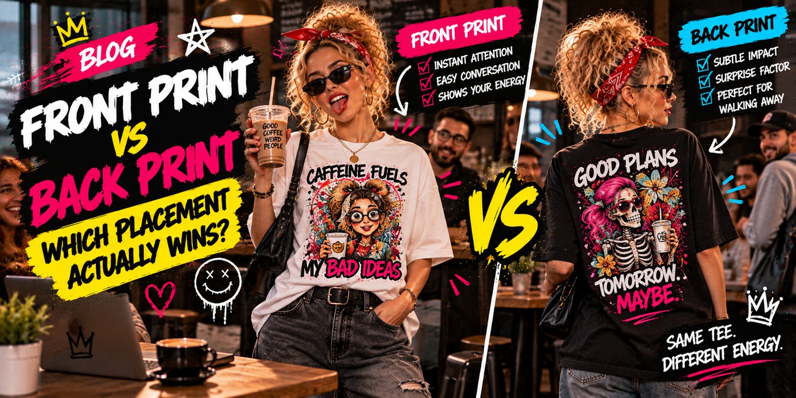
Walking into a crowded coffee shop with a chest print invites direct banter, while a back graphic only delivers the joke once you have turned around to leave. Placement alters how the room processes your weirdness long before anyone hears your voice.
Choosing a front or back graphic tee is an exercise in managing your social battery. Print positioning determines whether you want strangers locking eyes with your ribs or chuckling behind your shoulder blades while waiting in line for a breakfast sandwich.
One option forces you to field spontaneous commentary from the cashier, while the other lets the punchline linger behind you as an exit cue. Getting the location right is purely about picking your battles.
Chest Graphics Demand Immediate Social Engagement
Positioning visual art across your sternum turns every step forward into an immediate broadcast. You enter a hallway or stride toward an open patio, and your visual sensibilities arrive five paces ahead of your voice. Front prints do not wait for an invitation, nor do they rely on subtle glances over an espresso machine. Anyone looking in your direction receives the whole premise point-blank, establishing an instant dynamic before a syllable leaves your mouth.
Look at the mechanics of ordering an iced coffee on a humid morning. You step up to the counter, prepare to tap your debit card on the payment terminal, and brace for thirty seconds of neutral retail silence. Instead, the barista stops mid-punch on the register, stares directly at the illustration centered on your cotton shirt, and delivers a candid opinion about the joke. The layout dictated the entire interaction. People instinctively scan down from the eyes to the collarbone during small exchanges, guaranteeing that high-chest comedy lands without delay.
That unblinking visibility operates as an instant social filter. Passersby with an identical taste for the bizarre light up in grocery aisles or offer approving nods across crowded subway cars. People who prefer unprinted gray crewnecks glance at the absurd design, register mild confusion, and wonder why someone would parade that concept through public daylight. There is no middle ground, and that polarization is a feature rather than a flaw.
Putting ink right over your heart also commits your body language. You cannot slump into a corner or attempt casual stealth when a vivid visual joke faces outward into the room. Forward-facing prints thrive on eye contact and social friction. Every neighbor waiting near the mailboxes and every stranger holding an elevator door gets exposed to the art without working for it.
Choosing this orientation means you actively want the feedback loop. You bypass formal introductions, strip away the dull pleasantries, and let an unapologetic piece of weirdness do the heavy lifting. If the goal is breaking the ice before you even clear your throat, putting the message straight out front accomplishes the job instantly.
Layering Destroys Back Prints Instantly
The moment outside temperatures dip below room comfort, rear placement runs into a brick wall. You can invest in the sharpest design in your drawer, but unless you plan on shivering through brisk winds in bare cotton sleeves, outerwear is going to swallow it whole. Autumn and winter demand jackets, fleeces, and button-down shirts, and every single one of those layers immediately hides your upper spine.
Picture standing on a windy train platform in a winter jacket where nobody can see the artwork across your shoulder blades. You might know there is a brilliant graphic resting back there, but to the commuters shivering around you, you are merely another anonymous silhouette wrapped in dark nylon. The ink you paid for ends up spending eight hours trapped against the interior satin lining of a coat.
Open layers give chest graphics an unbeatable tactical edge during colder months. An unbuttoned heavy flannel or a stiff denim jacket splits down the sternum, keeping your visual punchline on full display while preserving your body heat. You can stroll through drafty office hallways or sit down at an outdoor cafe table without unbuttoning your outerwear to prove you wore something interesting.
That framing makes a piece like the Look Busy Panic Later Shirt ideal for high-stress workdays, letting anyone running on pure caffeine broadcast their corporate survival instincts beneath an open cardigan. The sentiment stays readable while you stay insulated against chilly cubicle drafts. A rear graphic in that same room is trapped behind your desk chair or buried under wool.
Choosing chest placement simply respects the realities of a four-season closet. If you live anywhere that sees frost or crisp breezes, spine prints spend six months locked in dark storage. Chest placement lets you pile on warmth without turning your shirts into unseen secrets.
Back Prints Master the Exit Joke
Comedic timing hinges entirely on spatial sequence. A forward-facing image demands an instant greeting the moment you step into the room, setting expectations before you even pull up a chair. Shifting the joke across your shoulder blades changes the entire tempo. It acts as visual punctuation, holding the punchline in reserve until your business is wrapped up and your boots are pointed toward the exit.
Picture the coworker wrapping up a ninety-minute strategy session that could have been handled over email. They snap their notebook shut, offer a courteous nod to the team, and head straight for the hallway. The remaining attendees catch the print across their shoulders, triggering a sudden wave of laughter right as the door clicks shut into its frame. That release breaks the lingering tension, yet the person who sparked the reaction is already thirty paces down the corridor and completely insulated from awkward follow-up chatter.
That intentional lag provides an incredible buffer during everyday interactions. A chest emblem practically invites bystanders to initiate casual banter while they decipher whatever phrase rests across your ribs. Shifting the humor to your spine strips away that conversational toll. People process the gag together in your wake, turning the observation into a communal moment while you keep moving smoothly toward your next errand.
This dynamic turns the I'm Not for Everyone Shirt into the ultimate parting statement. Anchoring that sentiment across your back suits anyone who wants to deliver a dry, self-aware critique of the room they are actively abandoning. You broadcast the blunt truth of the phrase without feeling obligated to stay behind and soften the delivery.
Choosing a reverse layout ultimately comes down to controlling your personal social clock. Leaving your best material across your shoulder blades lets you drop a final quip at the absolute end of an encounter, slip around the nearest corner, and let the room enjoy the punchline on their own time.
Front Graphics Are a Trap for Introverts
Standard style guides treat outward chest art like an undisputed asset, arguing that funny slogans should live where eye contact happens. That logic quickly turns toxic if you guard your personal bandwidth. Placing an absurd gag right above your sternum effectively turns your torso into public property. Anyone debating which front or back graphic tee fits their morning routine needs to tally the hidden tax of spontaneous socializing.
Consider the quiet elevator ride down to the apartment lobby. You step inside with over-ear headphones firmly clamped down, fixating on the floor indicator and hoping for twenty seconds of blissful isolation. A chatty neighbor shuffles in on five, catches the bold text plastered across your ribs, and perks up. Instead of a peaceful descent, that single line of chest-height copy gives them permission to hijack your morning and dump a detailed breakdown of their car trouble directly into your ears.
“Placing an absurd gag right above your sternum effectively turns your torso into public property.”
The irony gets worse when your apparel is explicitly designed to signal detachment. Slipping on the Not My Problem Duck Shirt seems like an easy shortcut to ward off nonsense, yet it routinely creates the opposite outcome. An overtired pharmacist scanning your pickup bag spots the pun, chuckles, and immediately takes the bait to launch into an unsolicited rant about the supply chain. A phrase meant to shrug off the universe ends up recruiting new chatterboxes.
Everyday errands demand efficiency, not accidental mingling. When you need to grab allergy meds, collect dry cleaning, or navigate a crowded subway car without breaking your stride, visible humor creates friction. You spend your finite afternoon patience manufacturing polite grins, nodding along to rambling banter, and plotting exits from discussions you never meant to open.
Chest art belongs in crowded backyard barbecues, trivia nights, or lively breweries where trading witty banter is the explicit plan. On low-battery days when your sole objective is grabbing a takeout burrito and retreating to the sofa unnoticed, keep the front plain and let the jokes stay hidden.
Everyday Commuting Ruins Rear Readability
The daily trek to the office transforms your torso into an obstacle course long before you scan your security badge. Anyone navigating turnstiles, bus terminals, or parking garages quickly discovers that utility destroys aesthetics. Great spine artwork requires an empty, unobstructed surface to land properly, an impossible luxury the second you strap on heavy gear for a morning commute across town.
Picture a city rider hauling a packed two-strap canvas pack during rush hour. Those thick nylon straps clamp down hard across both shoulder blades, bisecting the central illustration like a pair of heavy blackout curtains. Half the joke disappears beneath reinforced synthetic webbing, while the lower hem crumples against the bottom of the bag into an unreadable ball of fabric.
- Padded harness straps slice right down the center of an illustration, chopping punchlines into disjointed fragments.
- Throwing a heavy crossbody messenger bag over one shoulder pulls torso fabric sideways until the artwork distorts.
- Molded fiberglass transit benches press flat against your spine, keeping designs completely smothered for forty minutes.
- Dropped outerwear hoods flop backward over the neckband to obscure the top lines of typography.
Public seating compounds the visual blackout. The moment you slide onto an orange train chair or lean against a metal partition, your back vanishes entirely into the municipal architecture. You essentially turn into an advert pressed flat against a brick wall. Unless other passengers possess x-ray vision, that detailed rear print spends high-traffic travel windows staring straight into scratched plastic, foam cushioning, and dirty glass.
Chest prints operate under an entirely different set of rules on crowded transit routes. Your sternum stays exposed while reaching high for an overhead handrail, balancing an iced drink, or showing a digital boarding pass at the gate. The design sits dead center, completely flat, and immediately clear to everyone sharing your subway car. Daily travel exposes the mechanical truth of apparel real estate: if an illustration spends two hours buried under commuting gear, nobody actually gets the joke.
Match Placement to Your Social Energy
Choosing between a front or back graphic tee boils down to a tactical audit of your daily social stamina. Front-facing artwork opens up an active reception desk on your ribs, signaling that you have the time to chat with anyone in your path. Stashing the visual payoff along your upper dorsal territory establishes an immediate boundary. When you match your clothing with your actual emotional reserves, you never end up trapped in accidental banter when your battery is drained.
Targeting the collarbone and sternum works wonders when an outing demands fast, friction-free mingling. Picture a lively Saturday barbecue where folding lawn chairs dot the yard and paper plates balance on knees. Stepping onto the patio holding a bowl of potato salad, the illustration across your front instantly defuses the room. People register the punchline as you walk toward the cooler, launching easy laughs and chatter before you even pull a beverage from the ice.
Flip the script when your afternoon involves zero desire for spoken conversation. Consider an hour spent flipping through vintage vinyl sleeves in the quiet corner of an independent record store. You want to browse milk crates undisturbed, hunting rare pressings while tuning out the background hum. A sprawling illustration spanning your reverse side delivers entertainment to the shopper two aisles back, keeping your focus intact without requiring a single nodded acknowledgment.
Outdoor weather conditions complete the equation. A crisp, sunny afternoon without an extra layer creates the golden window for rear graphics to roam free and legible. But the second falling temperatures force you into an unbuttoned corduroy shirt or an open utility jacket, chest placement becomes mandatory. Keeping the visual punch up front prevents your graphic from suffocating inside a dark interior lining during cold snaps.
Taking thirty seconds to assess your afternoon agenda spares you hours of conversational regret. You control whether your clothes broadcast an open invitation to the sidewalk or maintain a polite barrier between your private thoughts and the rest of humanity.
Point the joke where you actually plan to look.